When styling our products we want to ensure you, the customer, are getting the best possible idea of what our tiles are going to look like in your real life home, and hopefully give you a bit of inspiration on how to style them. We pride ourselves on styling the products, to allow you to make the best possible decision for your and your home.
A new addition to our wide selection of products is the one and only Slate Way. This range has been cleverly styled to show you what they look like in real spaces, with earthy tones and neutral palettes. The Slate Way range is a selection of natural slate effect tiles packed with personality and detail for a modern space. Here’s an insight into how we styled the Slate Way range for a bit of slate tile inspiration.
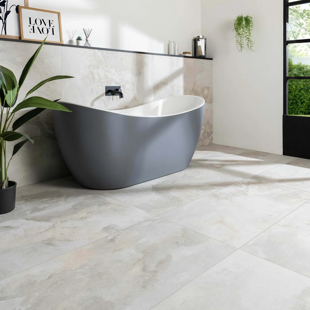
Slate Way Light Grey:
Above, Slate Way Light Matt Porcelain Wall and Floor Tile 120×60
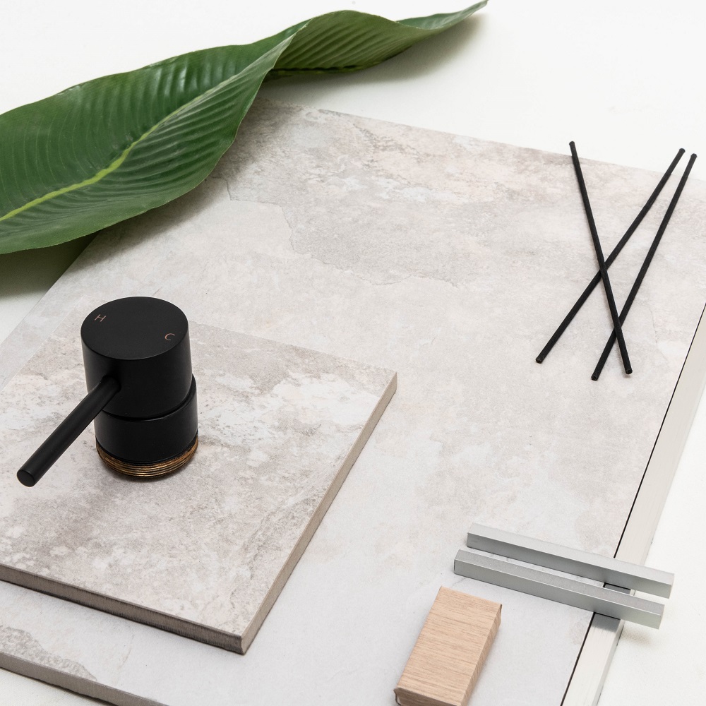
For the Slate Way Light Grey tiles, we’ve used a modern bathroom to complement a light, airy and elegant space. Our stylist opted for a large window to let in plenty of lighting, giving the tiles a blanket of light to awaken their detailing. The tiles are paired with a white paint, to showcase a theme of renewal, freshness and calm.
Using too many details in the same shade range can create quite a two dimensional space that looks flat and lifeless, so to prevent this, we’ve introduced the addition of matt black details throughout the bathroom. These push through the soft cream tones to lift the darker details from the slate effect within the tile.
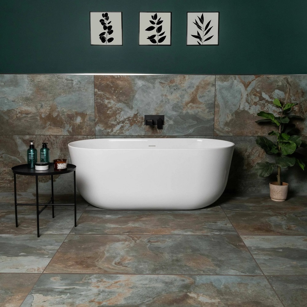
Slate Way Green:
Above, Slate Way Green Matt Porcelain Wall and Floor Tile 120×60
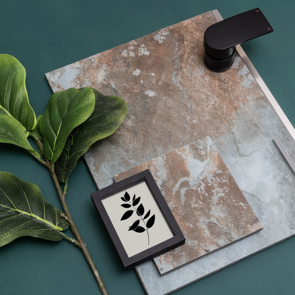
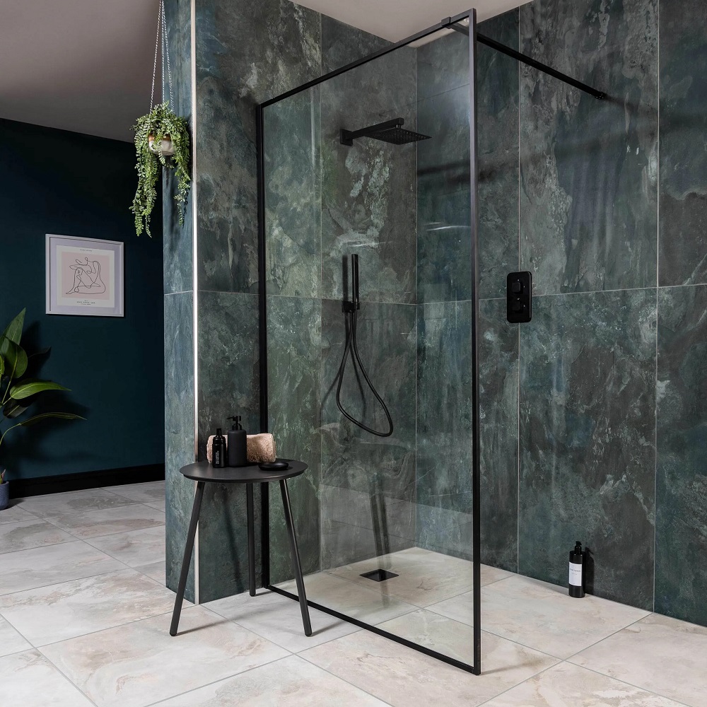
Slate Way Green is a much earthier colour, with natural shades of browns running throughout, working closely with the green to create this realistic slate look. This tile has been paired with a block green paint wall, which does a great job at pulling out the hues and textures within the tile.
Our stylist has cleverly used black accents throughout this design, which elevates the space beautifully. Bathroom Mountain have a range of black taps and accents to compliment your very own home, making it easy to recreate this space. The addition of a larger plant brings this scheme back down to earth, complimented by it’s concrete effect pot.
Slate Way Grey:
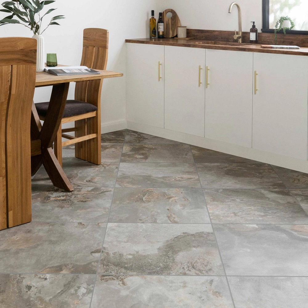
Above, Slate Way Grey Matt Porcelain Floor Tile 60×60
Slate Way Grey is a darker shade of modern grey, with more neutral brown tones poking through in their detailing. The smooth white wall works alongside these tiles, allowing their colouring to shine through, pulling every tone within the tile out. To introduce a sense of warmth to our kitchen, our stylist has used warmer wood tones and gold details, creating a comforting and homely environment. The window in this design is a major focal point, adding light to the darker accessories throughout the space.
Slate Way Blue:
Above, Slate Way Blue Matt Porcelain Wall and Floor Tile 120×60
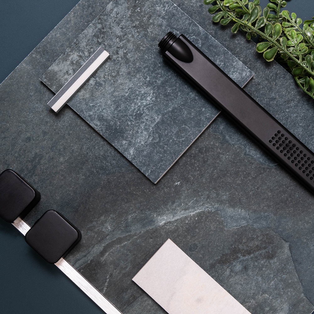
Slate Way Blue carries masses of tonal detail throughout, with hints of green, blue and grey. For this shower area we have used the sister Slate Way Light Grey tiles, to introduce the ever popular navy and grey colour pairing. To contrast the coolness of this tile combination, our stylist introduced a series of cream details, in the towel, the hanging plant and the print.
The foliage within this design adds life, creating interest to the space. The clean and precise scheme integrates soft and textured details, balancing the raw, natural texture of natural slate. With the combination of blues, grey’s and greens, this design presents itself to be biophilic, creating a spa like space.
We hope our designs have inspired you to consider Slate Way, and have shown you that any tile can create a truly comforting and homely space. Be sure to tag us in pictures of your styling projects on Instagram, @Tilemountain, we love seeing our products in your homes!

